GSoC 2024: Visualise community data, final report

My project on community data visualisation is soon coming to a close; it’s time to review the work and what the outcomes were. The main goal of the project was to

build a [data] pipeline from the JSON directory through to some visualisations on a web page.

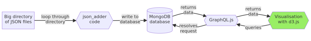
With some caveats, we’ve successfully achieved that. I made a tool (json_adder) which reads the JSON files into a MongoDB database, with a set of resolvers which provide a query interface, and finally some graphs which call the query interface and render the data using the d3 javascript library.

Beyond that, GraphQL was supposed to allow anyone else to

query the data for their own purposes.

I haven’t achieved this, partly due to the limits of GraphQL, which is better designed to service web apps than free-form queries. Queries are flexible only to the extent that they’re defined in the schema. Secondly, all of this is still only deployed locally, although it’s ready to deploy to production when needed.

At least the most difficult part of the project is over, the infrastructure is all there, and now the barrier to entry is much lower for anyone wanting to make a visualisation. New queries / visualisations can be contributed back to Freifunk’s vis.api.freifunk.net repository on Github.

Graphs

Top ten communities with the most nodes

This graph is very simple, top of the list here is Münsterland with 3,993 nodes at the time of writing. This doesn’t quite tell the whole story, because unlike city-based communities in this lineup, the Münsterland nodes are spread far and wide around Münster itself. Nevertheless, congratulations to Münsterland for the excellent network coverage!

Sources: MongoDB query, d3 code.

This bar graph was the first one I made, as a simple proof of concept. Since this worked well enough, I moved on to a line graph example, something which could take advantage of the time-series data we have.

Growth of the network over time

This graph shows the sum total of nodes across the network per month, from 2014-2024. The number of nodes grew rapidly from 2014-2017 before tapering off into a stable plateau. The high point ran through September and October 2019, with around 50,700 nodes at the peak.

Sources: MongoDB query, d3 code.

For some context on this curve, Freifunk as a project began in 2004, and only started collecting this API data in 2014. Part of the initial growth in nodes could be accounted for by new communities slowly registering their data with the API.

The query behind this graph became too slow after I’d imported the full 2014-2024 hourly dataset into MongoDB.1 Daily data was more performant, but was still unnecessarily granular, so what you see here is grouped by daily-average per month.

For shorter time periods, the data is still there to query by day or by hour, and this is something which could be worked into an interactive visualisation.

Routing protocols in use across the network

The next thing we wanted to see was the distribution of routing protocols. This graph is similar to the above, it counts the protocols used by each community every day, and averages the total each month.

Sources: MongoDB query, d3 code.

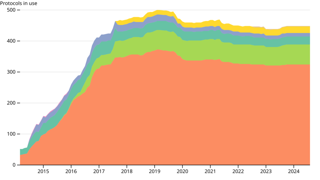
This graph doesn’t have a legend (#57), and the colours change on every page load (#56). I don’t know why the colours change like this, is this a common thing with d3? If anyone can resolve this, please help!

In the meantime, I have copied the d3 swatches example, to make a custom legend for the above graph.

We see that batman-adv is by far the most popular protocol, followed by 802.11s, which appears in the dataset in Duisberg in August 2015.

Remaining work

Everything here is all working locally, which leaves the main remaining task to try to deploy it somewhere for public use. We always had in mind that this would have to be deployed somewhere for public use eventually. So, thankfully we’ve already done some of this work and most of the services involved here can be easily packaged up and deployed to production. Andi is going to investigate webpack for bundling the javascript, trying to avoid having to procure (and especially maintain) another server.

Outstanding issues

  • Make graphs interactive (#47).
  • Provide snippets that can be embedded in community web pages (#49).

There isn’t a Github issue for this, but the graph page is really a test page with only enough boilerplate HTML to show the graphs. The page would benefit from some styling, a small amount of CSS to make it look more… refined.

Visualisation ideas

  • A word cloud of communities, scaled by node count (#46).
  • A heatmap of communities across the network, showing geographical concentrations of nodes (#41).
  • Hours of the day with most nodes online (#12).

Things I learned

This was my first time building a traditional web service end to end, from the database all the way through to a finished graph. In the end, the final three graphs do not look individually impressive, but a lot of work went into the process.

I took the opportunity to write the data loading code in Rust, and while I am proud of that, it took me a long time to write and wasn’t easy for others to contribute to. Andi rewrote this data loading code in Python much more quickly, and then made useful additions to it. Coding in a well-understood language like Python had advantages for project architecture which outweighed whatever technical arguments could be had around Rust.

In a similar vein, I learned how to write GraphQL schemas and queries, and arrived at the conclusion that GraphQL is not ideally suited for the kind of public query interface that I had in mind. The happy side of this lesson was that I ended up relying on MongoDB functions, and became better at writing those instead.

  1. As an aside, importing the full decade’s worth of hourly data made my (high end workstation) desktop computer really sweat. It was very satisfying to start the import, hear the fans on my computer spinning up to full speed, and physically feel the weight of all that processing. ↩︎

GSoC 2024: Visualise community data, update 1

I’ve set up a lot of services since planning out the data pipeline in June; the new infrastructure diagram looks like this:

So, I wrote a little Rust utility called json_adder which takes the JSON files and reads the data into a MongoDB collection. We also have a GraphQL server, running through Node.js, which can handle some (very) simple queries and return data. Many of these services are individually easy to set up, the tricky part is making sure everything works together correctly. This is what your favourite technical consultancies call “fullstack development”.

Data loading

The first change from the initial plan was to use MongoDB instead of MySQL as a database. MongoDB has a built-in feature for handling time-series data, which is what we’re working with. It integrates well enough with GraphQL, and since one of my mentors (Andi Bräu) works with MongoDB on a daily basis, there’s a lot of experience to draw upon.

Here is the Rust code for the utility which adds the data to the database, and here’s what it does:

  • Read over each JSON file in the directory in a loop.
  • Extract the last-modified time from each community in the file and do some conversion to BSON.
  • Read the data into a struct, and add each object to a vector.
  • Insert the vector into the MongoDB collection.
  • GOTO next file.

When setting up the connection to MongoDB, the setup_db module will also check to create the collection if it doesn’t exist. This extra bit of logic is ready for when this has to be run in an automated process, which might involve setting up the database and filling it with data in one go.

I don’t have a binary to link here, and will write build instructions in future.1 On each commit which changes Rust code, Github Actions runs cargo check on the repository. When it comes to deploying this in reality, we can change that workflow to provide release builds.

At the moment it is a one-way process. You point json_adder at the data directory and it adds everything to the database. For future work, I’ll need a way to keep the database in sync, only add the files which have been modified, run it on a schedule. For now, it works fine.

GraphQL

Here is the GraphQL server code. Fetch the dependencies, in this order:

npm install express express-graphql graphql mongodb

The ordering of these is important.

Then, run npm start, and open http://localhost:4000/api in your browser, you should see the GraphQL IDE.

At the moment, the GraphQL can handle a query with an argument for metadata. I’ll build out the schema, and the resolver, to handle more arguments / more complicated queries. A lot of the documentation for GraphQL assumes a fairly simple schema, built for handling calls to a web app, which is slightly different from our case. The JSON Schema for the Freifunk API is not only quite long, it is also versioned, and newer versions are not necessarily backwards-compatible. I am going to sidestep this complexity by writing a GraphQL schema which only includes fields available in all versions. My first working example to try is a query which counts the number of nodes per community.

You’ll notice that the last step in in the pipeline is yet to be completed, I don’t have a visualisation to show. But, now that we can reliably pull data all the way through the pipeline, we’re almost ready to make some graphs.

  1. In the meantime, you only need to run cargo build in the json_adder directory. ↩︎

GSoC 2024: Visualise community data

Hello everyone, I’m Pierre, I was first introduced to Freifunk when searching for free WiFi in a cafe in Berlin, and I’m inspired by the radical visions of people attaching antennas to apartment buildings. Now I’m here to work on the community data API.

Since 2014, Freifunk has been collecting a snapshot of information about all communities, every hour, in a big directory available here. At the moment the data is being used for a calendar, a news feed,1 and a map of communities, among other services. Maybe you can think of lots of other things which could be done with that data, but first you would have to parse some 80,000+ compressed JSON files.

The goal of this Summer of Code project is to overcome that hurdle up front; make this community data more easily accessible, and uncover some insights about the network along the way. This is a typical situation for large archives, where one of the key challenges is making data readable and useful.

I intend to build a pipeline from the JSON directory through to some visualisations on a web page. One step behind that, I want to expose a GraphQL interface so that anyone else can query the data for their own purposes. The main part of this project revolves around setting up infrastructure to handle each section of this pipeline.

Although this system is conceptually very simple, there are lots of moving parts involved. The JSON files are loaded into a SQL database, the database talks to GraphQL, which itself talks to some browser-based visualisation library.

I’ve tried to make choices which prioritise boring technologies, reduce the fragility of this process, and hopefully make it easy to maintain in future. I will build it from the top down; starting with the database, and finishing with the visualisations themselves.

I’ll be working in this repository. There’s not much to show at the moment, but it should rapidly take shape in the coming weeks. My next post will be about the process of loading these files into a database.

  1. On which this blog appears, hello! 👋 ↩︎